STAM101 :: Lecture 03 :: Graphical representation – Histogram – Frequency polygon and Frequency curve
![]()
Graphs
Graphs are charts consisting of points, lines and curves. Charts are drawn on graph sheets. Suitable scales are to be chosen for both x and y axes, so that the entire data can be presented in the graph sheet. Graphical representations are used for grouped quantitative data.
Histogram
When the data are classified based on the class intervals it can be represented by a histogram. Histogram is just like a simple bar diagram with minor differences. There is no gap between the bars, since the classes are continuous. The bars are drawn only in outline without colouring or marking as in the case of simple bar diagrams. It is the suitable form to represent a frequency distribution.
Class intervals are to be presented in x axis and the bases of the bars are the respective class intervals. Frequencies are to be represented in y axis. The heights of the bars are equal to the corresponding frequencies.
Example
Draw a histogram for the following data
Seed Yield (gms) |
No. of Plants |
2.5-3.5 |
4 |
3.5-4.5 |
6 |
4.5-5.5 |
10 |
5.5-6.5 |
26 |
6.5-7.5 |
24 |
7.5-8.5 |
15 |
8.5-9.5 |
10 |
9.5-10.5 |
5 |
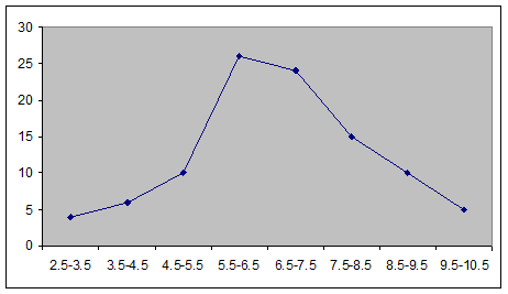
Frequency Polygon
The frequencies of the classes are plotted by dots against the mid-points of each class. The adjacent dots are then joined by straight lines. The resulting graph is known as frequency polygon.
Example
Draw frequency polygon for the following data
Seed Yield (gms) |
No. of Plants |
2.5-3.5 |
4 |
3.5-4.5 |
6 |
4.5-5.5 |
10 |
5.5-6.5 |
26 |
6.5-7.5 |
24 |
7.5-8.5 |
15 |
8.5-9.5 |
10 |
9.5-10.5 |
5 |
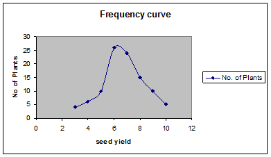
Frequency curve
The procedure for drawing a frequency curve is same as for frequency polygon. But the points are joined by smooth or free hand curve.
Example
Draw frequency curve for the following data
Seed Yield (gms) |
No. of Plants |
2.5-3.5 |
4 |
3.5-4.5 |
6 |
4.5-5.5 |
10 |
5.5-6.5 |
26 |
6.5-7.5 |
24 |
7.5-8.5 |
15 |
8.5-9.5 |
10 |
9.5-10.5 |
5 |
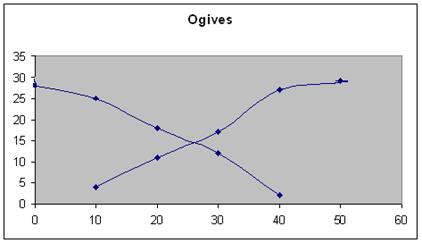
Ogives
Ogives are known also as cumulative frequency curves and there are two kinds of ogives. One is less than ogive and the other is more than ogive.
Less than ogive: Here the cumulative frequencies are plotted against the upper boundary of respective class interval.
Greater than ogive: Here the cumulative frequencies are plotted against the lower boundaries of respective class intervals.
Example
Continuous Interval |
Mid Point |
Frequency |
< cumulative Frequency |
> cumulative frequency |
0-10 |
5 |
4 |
4 |
29 |
10-20 |
15 |
7 |
11 |
25 |
20-30 |
25 |
6 |
17 |
18 |
30-40 |
35 |
10 |
27 |
12 |
40-50 |
45 |
2 |
29 |
2 |
Boundary values
| Download this lecture as PDF here |
![]()